Why A Growth Management System Starts With A Simple Line Graph
Here is what happens to most small businesses before they fail.
It is not one big disaster. It is a slow drift. Sales dip a little. Leads slow down. Nobody notices right away because nobody is looking closely enough or often enough. By the time it becomes obvious, the business is already in trouble.
Research on failed startups, cited by Zippia's 2026 small business report, found that 82 percent of failures involved cash flow problems. That number gets thrown around a lot, but here is what people miss about it. Running out of cash is rarely the actual root cause. It is the final symptom of something that started much earlier.
The real issue is confusion.
When you are starting out, if you are not tracking the handful of numbers that actually move your business up or down, you have no way of knowing what your next move should be. You are guessing. You might be guessing well. But you are still guessing.
The Trap Of More Features
Here is where most business owners go wrong trying to fix this.
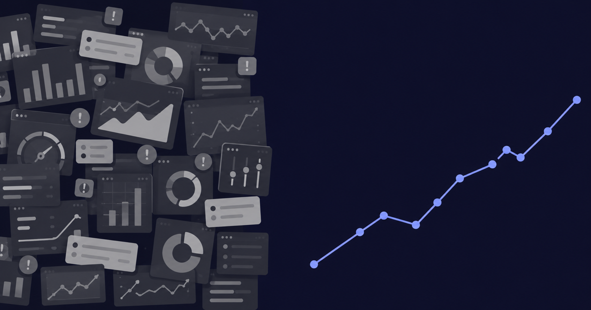
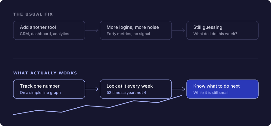
They add tech. A CRM. A marketing dashboard. An analytics suite. A project management tool. Each one promises clarity. Most of them just add another login and another notification.
Dashboards are helpful, no argument there. But a dashboard full of forty metrics does not tell you what to do this week. It tells you everything, which is almost the same as telling you nothing.
Compare that to something almost embarrassingly simple. One line graph. Tracking one number that actually matters. Printed out. Hung on the wall. Looked at every single week.
The Real Advantage Nobody Talks About
Most business owners plan by the quarter. That means they sit down, look at the numbers, and make decisions four times a year.
Four times.
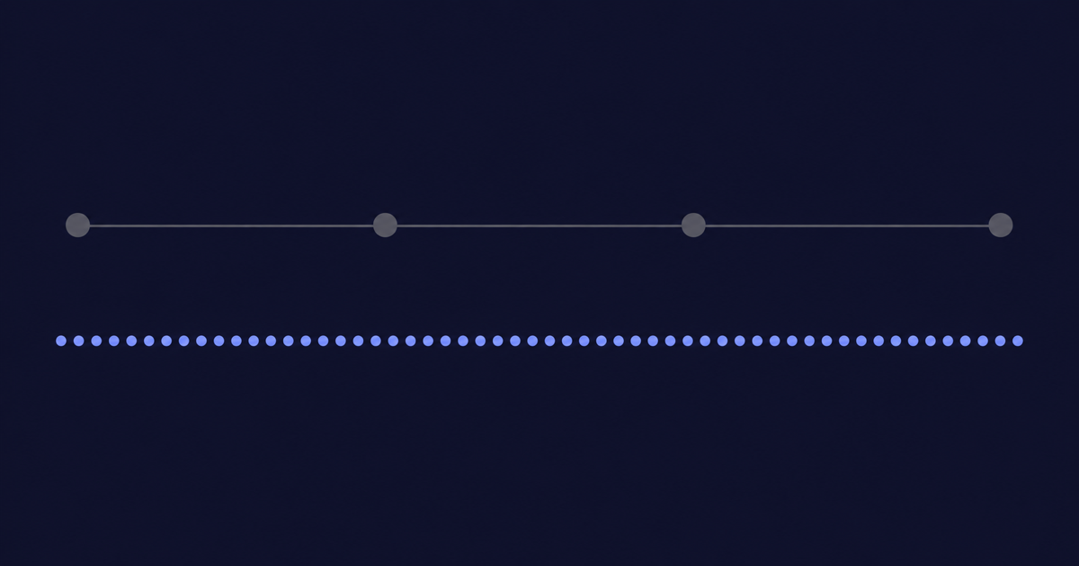
Now think about what changes when you cut off your week at the same time every week and look at your numbers then. Instead of planning four times a year, you are planning fifty two times a year.
That is not a small difference. That is thirteen times more chances to catch a problem while it is still small enough to fix, adjust a strategy that is not working, or double down on something that is. A competitor planning quarterly is flying mostly blind for weeks at a time. You are checking in every single week.
Management is really just observation done consistently. Watching the trend line, week after week, and adjusting before small problems become big ones. That is the entire skill. It is not complicated. It is just consistent.
You Never Outgrow The Line Graph
Here is the part people get wrong about business tools. They assume that as the business grows, the tools need to grow into something more complicated. More dashboards. More permissions. More features.
The line graph does not work that way. Whether you are a solopreneur checking your revenue trend on your phone or a small team tracking leads and sales together, the question is always the same. Are we headed in the right direction, or is there something to fix?
A line graph answers that question at any size. You do not outgrow it. You just add more of them as your business gets more complex, one clear line at a time, instead of trading it in for a system that buries the answer under features you will never use.
Where MarkMyGraph Fits
MarkMyGraph was built around this exact idea. Pick the numbers that actually matter to your business. Track them weekly. See the trend the moment you open the app.
No org chart to build first. No setup process standing between you and the answer. Three graphs are free, forever, with no time limit and no card. If you want more than three, unlimited is twenty-nine dollars a month, or twenty if you pay for the year.
You do not need more tech in your stack to fix a revenue problem. You need to know which levers are actually working, and you need to check in often enough to catch it when they stop.
Start with a simple line graph. Check it every week. That is the whole strategy.